Martian Chronicles
Welcome to the MarsBased blog, where we write about startups, technology and the remote work culture.

Linear AI: Is it any good?
We thought Linear AI was just another tech distraction, until we actually tried it. Find out why this new update is a secret superpower for Product Managers, not just developers.
Read full article
How we evaluate software engineers in the age of AI
What does a great software engineer look like today? A look inside our updated review templates and the new AI criteria we use to evaluate our team.
Read full article
Martian Retreat Pyrenees 2026: Reconnecting, growing, and reaching for the stars
Reconnecting, growing, and reaching for the stars at our Martian Retreat Pyrenees 2026.
Read full article
PSA: thekreatively.com scam campaign targeting agencies
This scam targets dev agencies and freelancers via contact form enquiries with large budgets, then funnels victims to a fake Google Sites page that serves malware via a fake certificate installer (.dmg).
Read full article
How "Don’t repeat yourself" can mess up with your AI-generated code
AI agents often over-abstract coincidental duplication, creating fragile architectures that increase cognitive load and technical debt. Prioritizing clear domain boundaries over rigid DRY principles is essential for keeping codebases maintainable for both humans and AI.
Read full article
The strategy behind the shift: Why MarsBased left Cursor for Claude Code
After starting with Cursor in 2024, we are now standardizing on Claude Code for our 2026 agentic strategy. This move marks our official shift from writing code to defining problems and steering the process.
Read full articleOur best articles
Chosen by our community of readers and clients.

How we use Claude for product management at MarsBased
How MarsBased uses Claude and Linear to automate PM workflows, shifting the role from administrative tasks to strategic product thinking.
Read full article
WebMCP: Making your website ready for AI agents
WebMCP is the new W3C standard that makes websites natively operable by AI agents, no slow vision models needed. Learn how to implement it in 15 minutes.
Read full article
MarsBased @ MWC & 4YFN 2026: The recap 🚀
Is coding becoming a commodity? Dive into our MWC 2026 recap to explore how Agentic AI is redefining the developer’s role and why the future belongs to the AI-native generation
Read full articleFrom our podcast
Our latest episodes on technology, entrepreneurship, and product development.

9 Jun 2026
El arte de la simplicidad: Alberto Betella y los 20 años de Podcast Generator
En este episodio celebramos un hito increíble: el 20º aniversario de Podcast Generator. Nos acompaña Alberto Betella para contarnos la histo
Listen now
2 Jun 2026
De CTO en startups a directiva en AWS: Evolución, IA y gestión de equipos con Susana Durán
En este nuevo episodio de Road to CTO, nos acompaña Susana Durán, quien actualmente lidera equipos de arquitectura y operaciones para los cl
Listen now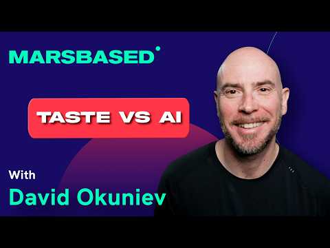
26 May 2026
Why the AI slop problem is getting worse | David Okuniev (Typeform co-founder)
The AI slop problem is getting worse. AI can crank out code, decks, and landing pages in minutes, but somehow everything starts to look exac
Listen nowComplex Ruby project, worldwide distributed stakeholders, thin definition. And with all that, MarsBased pulled it off. Great maintainable code, on time and within budget.

Former CTO @ Rakuten Europe